About the book
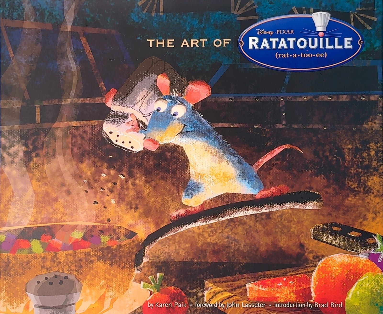
A rat who wants to cook in the one place rats are least welcome. That's the premise Brad Bird said hooked him, and The Art of Ratatouille is the record of how Pixar turned it into a film that looks and — somehow — tastes like Paris.
Karen Paik wrote it, with a foreword by John Lasseter and an introduction by Bird himself. It gathers more than 200 pieces: storyboards, full-color pastels, pencil and digital sketches, character studies, maquettes, lighting and shading tests, fur studies, matte paintings, model packets, even the discarded logo designs. And crucially — this matters more than it sounds — the artists talk. There are quotes from the director, the animators and the production team scattered all the way through, explaining why things ended up the way they did.
First impressions
This is Chronicle at their 2007 best: 9 × 11, generous pages, warm printing that handles Dominique Louis’s pastels without flattening them. The book has the same appetite as the film — it’s dense, it’s saturated, and it doesn’t waste space.
If you’ve picked up a few of the newer Pixar art books and come away feeling like you got a gallery instead of a making-of, this one is a useful reminder of what the series used to be. There’s real writing here, and it’s woven around the art rather than parked at the front.
Content
The Art of Ratatouille. 160 pages, hardcover, Chronicle Books, written by Karen Paik. Released May 2007, a few weeks before the film. A limited edition also existed, with five signed reproduction prints — worth knowing if you ever spot one secondhand.
Characters
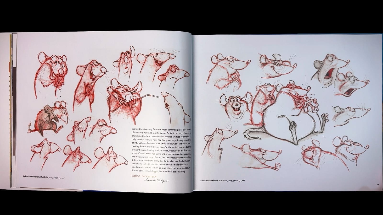
The rats are the design story, and the book doesn’t shy away from how hard they were.
The earliest versions were much more humanoid, and they were wrong. The team walked them back until they moved on all fours with anatomically believable muscle, so that Remy standing upright would mean something. Bird’s reasoning is in the book and it’s a good bit of storytelling logic: “When Remy gets on two legs, it’s a choice to emulate humans. He has reasons for doing that. It makes it a story point.”
And to get there, Pixar kept a vivarium of live rats in a studio hallway for more than a year. Animators walked past it every day, watching how real fur bunches, how ears swivel, how a tail actually behaves when the animal turns. You can see that study in the fur pages — they’re some of the most technical spreads in the book, and they earn it.
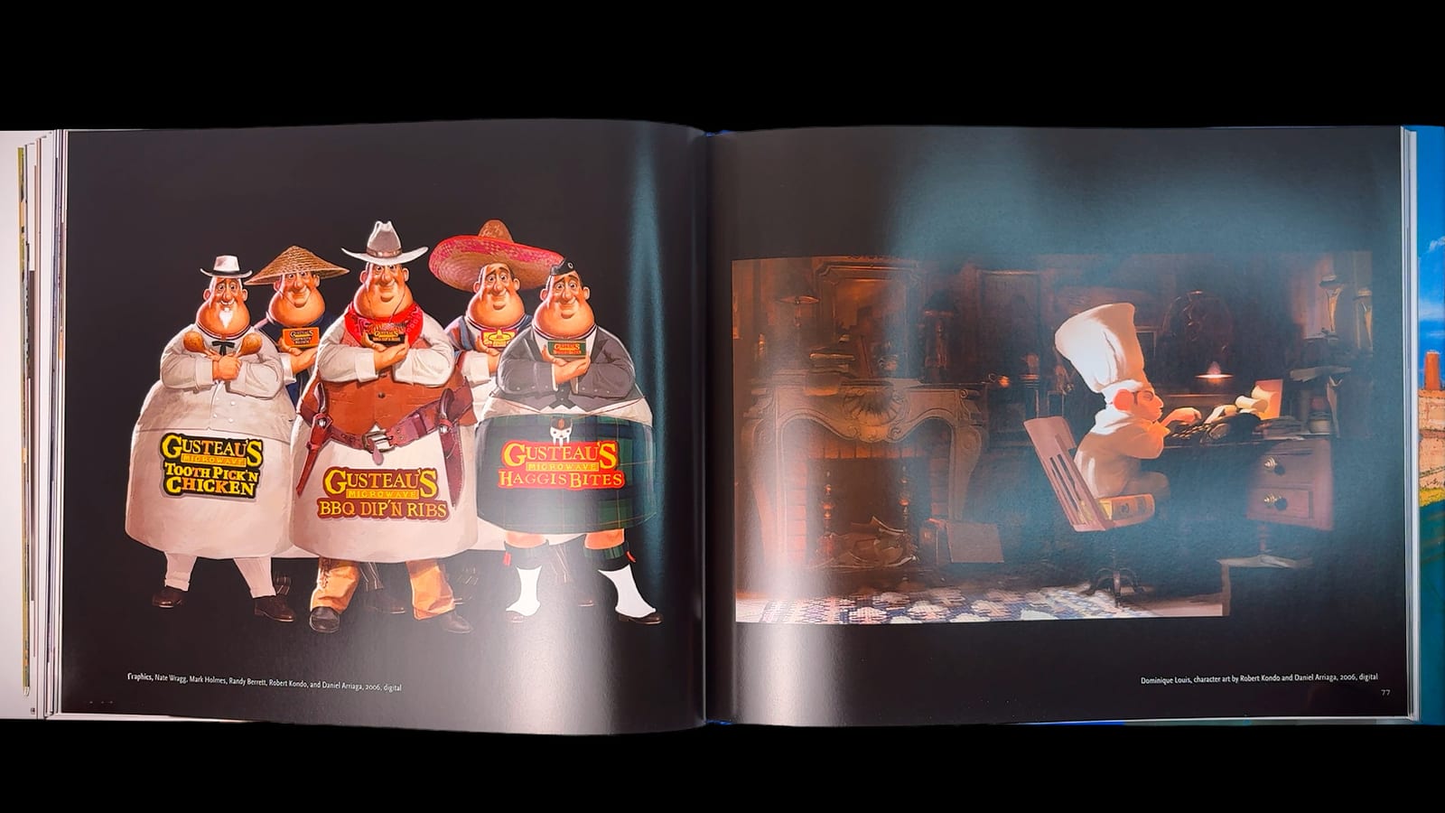
The humans got the opposite treatment: pushed, caricatured, built on strong silhouettes. Linguini is basically a collection of elbows, which was deliberate — Bird wanted a character who could carry physical comedy.
The journey through the story
Here’s the part the book handles more gracefully than you’d expect: Ratatouille had a difficult birth. Jan Pinkava originated it back in 2000 and built the foundational concepts, designs and characters. Bob Peterson came aboard as co-director in 2004. In 2005, with the story still unresolved, Pixar brought in Brad Bird, and the release slid from 2006 to 2007.
Bird rebuilt a lot: Gusteau stopped being a living character, Skinner and Colette grew, the rats got less human. Much of Pinkava’s early visual development survives in these pages, which makes the book quietly interesting as a document of a film that changed hands and kept its soul.
Then there’s the research. Bird, producer Brad Lewis and the crew spent a week in Paris, getting around by motorcycle and eating at five of the city’s best restaurants — which sounds like a boondoggle until you see how specific the reference photography got. Lewis went further: chef Thomas Keller let him intern at The French Laundry, and Keller is the one who devised the confit byaldi, the elegant layered ratatouille that Remy serves in the climax. Animators sat in on culinary school classes. When the food in that film looks like it was made by someone who cooks, it’s because it partly was.
The worlds
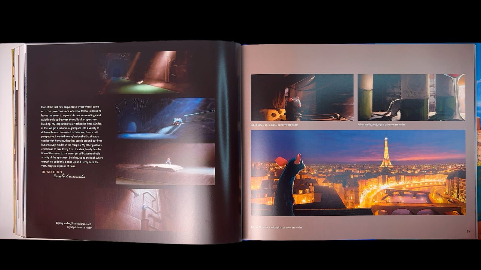
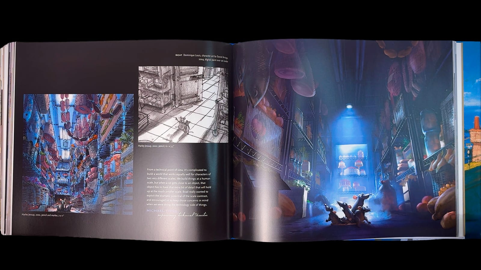
Harley Jessup was the production designer, and he and Bird went to Paris in October on purpose. The book explains the two things they took from that trip: Paris is built from limestone, so the whole city sits in warm honey-tan tones, and autumn light there is soft and silvery, with shadows that barely commit. That’s the film’s entire look, reverse-engineered from a season.
Sharon Calahan’s lighting work gets proper space too. Her stated goal is one of my favorite quotes in any of these books: “I wanted people to leave the theater feeling hungry.” Her approach was to keep the overall palette deliberately neutral so that skin and food would be the most saturated things on screen, and to hold red in reserve for the dramatic beats — which is why Skinner’s scooter chase hits the way it does.
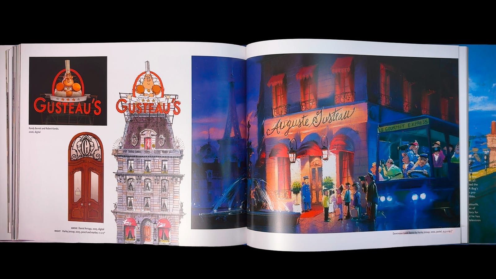
The kitchen itself, Gusteau’s dining room, Anton Ego’s coffin-shaped office, the Paris rooftops, the sewers: all of it is here in layout and matte painting form.
What’s inside
The book runs through the production more or less in order:
- Character design — rats and humans, from early humanoid passes to final maquettes.
- Environments — Paris, the restaurant, the sewers, Ego’s office, rendered in pastel and paint.
- Food & technical studies — fur tests, shading and lighting studies, the work behind making vegetables look edible.
- Storyboards & color — story gags, sequence boards and the color logic of the film.
One small thing a reviewer noticed that stuck with me: the storyboards in this book are followed almost exactly in the finished film. That’s rare, and it tells you how locked the story was once Bird had it.
The artwork
The pastels are the reason to own this. Dominique Louis’s work in particular has a softness that reproduces beautifully at this size, and the food renders are genuinely a little cruel to look at when hungry.
If I’m reaching for a criticism, it’s that the book is so packed that a few of the technical sections go by faster than they deserve — the subsurface scattering work that made the fruit and vegetables glow (the same technique Pixar had used on skin in The Incredibles) could have used another spread. But that’s the complaint of someone who wanted more, which is the good kind.
Video Preview
New artbook videos every week
Subscribe for more animation and concept art content.
▶ Subscribe on YouTubeIs it worth it?
For anyone who cares about Pixar’s craft era, yes. It’s one of the strongest books in the whole “Art of” line — the art is gorgeous and the commentary actually explains things, which is a combination the series hasn’t always managed since.
It’s also the book I’d hand to someone who says they don’t understand why animation takes so long. A year of live rats in a hallway is a pretty good answer.
Verdict: one of the best Pixar art books ever published, and the closest thing to a working document of how the film’s look was found.
Value
List price is $42.50 / CA$55 / £30 / €38, but it’s been out since 2007 and availability comes and goes — new copies aren’t always easy to find, and prices swing depending on the seller. Secondhand copies are common and usually cheaper. If you ever find the limited edition with the signed prints, that’s the collector’s version.
If you decide to pick it up, the links at the end of this post are affiliate links. It costs you nothing extra and it helps keep this channel going.
📚 Want this book? Grab your copy:
As an Amazon Associate we earn from qualifying purchases. Other links above are also affiliate links — if you buy through them we may earn a small commission at no extra cost to you.
Stream the film on Disney+